How to Track Device Breakdown for Freelancers
Your freelance design portfolio gets 300 visitors a month. You landed three clients. But you have no idea if those clients found you on their phones while scrolling through options or on their computers during work hours. Device breakdown tells you how clients actually find you.
Why Device Breakdown Matters for Freelancers
Freelancers often have small marketing budgets, so every website visitor counts. Device breakdown helps you make the most of your traffic.
First, it reveals client behavior. Mobile visitors might be in research mode, comparing options quickly. Desktop visitors might be ready to hire and want detailed information. Second, it guides portfolio design. If 70% of visitors are on mobile, your portfolio must look amazing on small screens. Third, it optimizes contact options. Mobile users prefer email or text, while desktop users might fill out a contact form. Fourth, it improves outreach strategy. LinkedIn messages reach desktop users differently than Instagram DMs reach mobile users.
How to Check in GA4
Google Analytics 4 tracks device data, but you need to know how to use it for your freelance business.
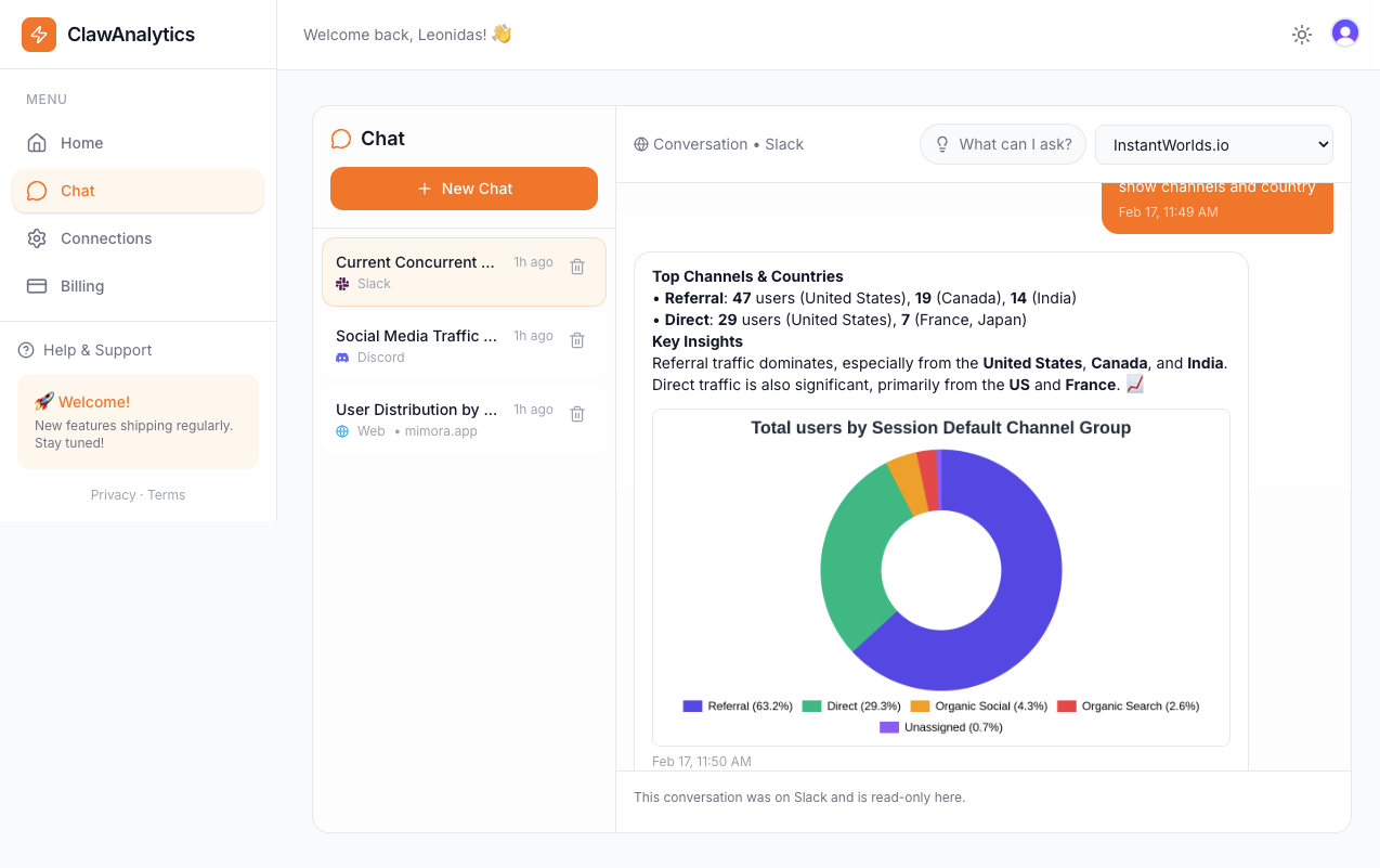
Go to Reports, then Lifecycle, then Engagement, then Users by Device. This shows your visitor split. Now add a conversion metric, like contact form submissions or booking button clicks, to see which devices actually generate leads.
Also check Traffic Acquisition with Device category as a secondary dimension. This shows which channels bring which devices. You might find that Instagram brings mobile visitors while LinkedIn brings desktop visitors. This helps you prioritize the right platforms.
The Easier Way
Freelancers need simple tools that do not require analytics expertise. ClawAnalytics delivers this.
ClawAnalytics connects to your website and shows device breakdown in plain language. You can ask “Are mobile visitors booking calls?” or “What devices do my clients use?” and get clear answers without navigating complex GA4 reports.
The tool also tracks trends over time. You see if your mobile experience is improving or if desktop visitors are becoming more valuable. This helps you decide where to invest in your website.
Quick Wins
Here are three things you can do today to improve device-specific performance.
Test your portfolio on your phone. Show it to yourself on a mobile device. Is your work easy to see? Is your contact info easy to find?
Make your contact options clear for mobile. Add a click-to-call button and make your email easy to copy. Mobile users should be able to reach you in one tap.
Check which pages get mobile traffic. If your case studies get mobile views, make sure they load fast and look good on small screens.