Imagine a busy Friday night. Your restaurant’s website is getting hits, but customers are leaving before ordering online. The problem might not be your menu—it could be how they’re viewing it.
Device breakdown tells you whether customers are visiting from phones, tablets, or desktops. For restaurants, this insight directly impacts revenue.
Why Device Breakdown Matters for Restaurants
Mobile ordering dominates the restaurant industry. When customers are hungry and nearby, they pull out their phones to find options. If your site isn’t mobile-friendly, they move on.
Key reasons to track device breakdown:
- Mobile users expect fast loading. A slow site on phones means lost orders. Most restaurant searches happen within minutes of mealtime.
- Tablet traffic often means families. Groups planning dinner often research on iPads. They need detailed menus and photos.
- Desktop visitors may be corporate clients. Companies booking team lunches or event catering typically use computers. Their needs differ from casual diners.
- Cross-device behavior matters. A customer might browse on phone during lunch, then order on desktop later. Understanding this journey improves retargeting.
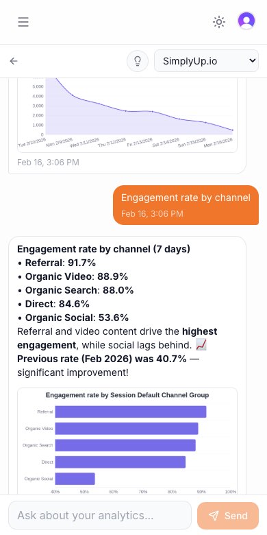
How to Check in GA4
To find device breakdown in Google Analytics 4:
- Log into GA4 and select your restaurant property
- Navigate to Reports > Traffic Acquisition
- Click the pencil icon to edit dimensions
- Add “Device category” as a secondary dimension
- Look for Mobile, Tablet, and Desktop splits
You’ll see percentage breakdowns. If mobile traffic exceeds 60% and your site has issues, that’s your priority fix.
The Easier Way
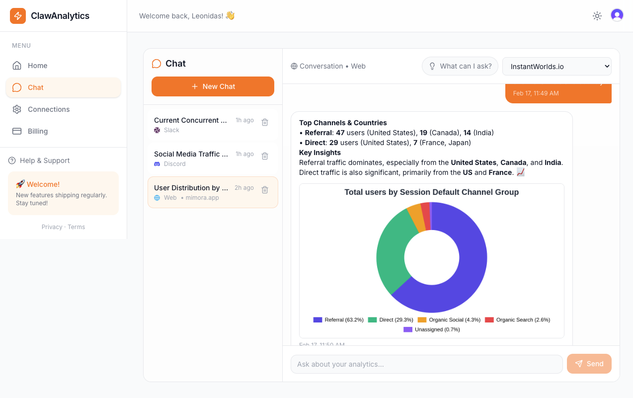
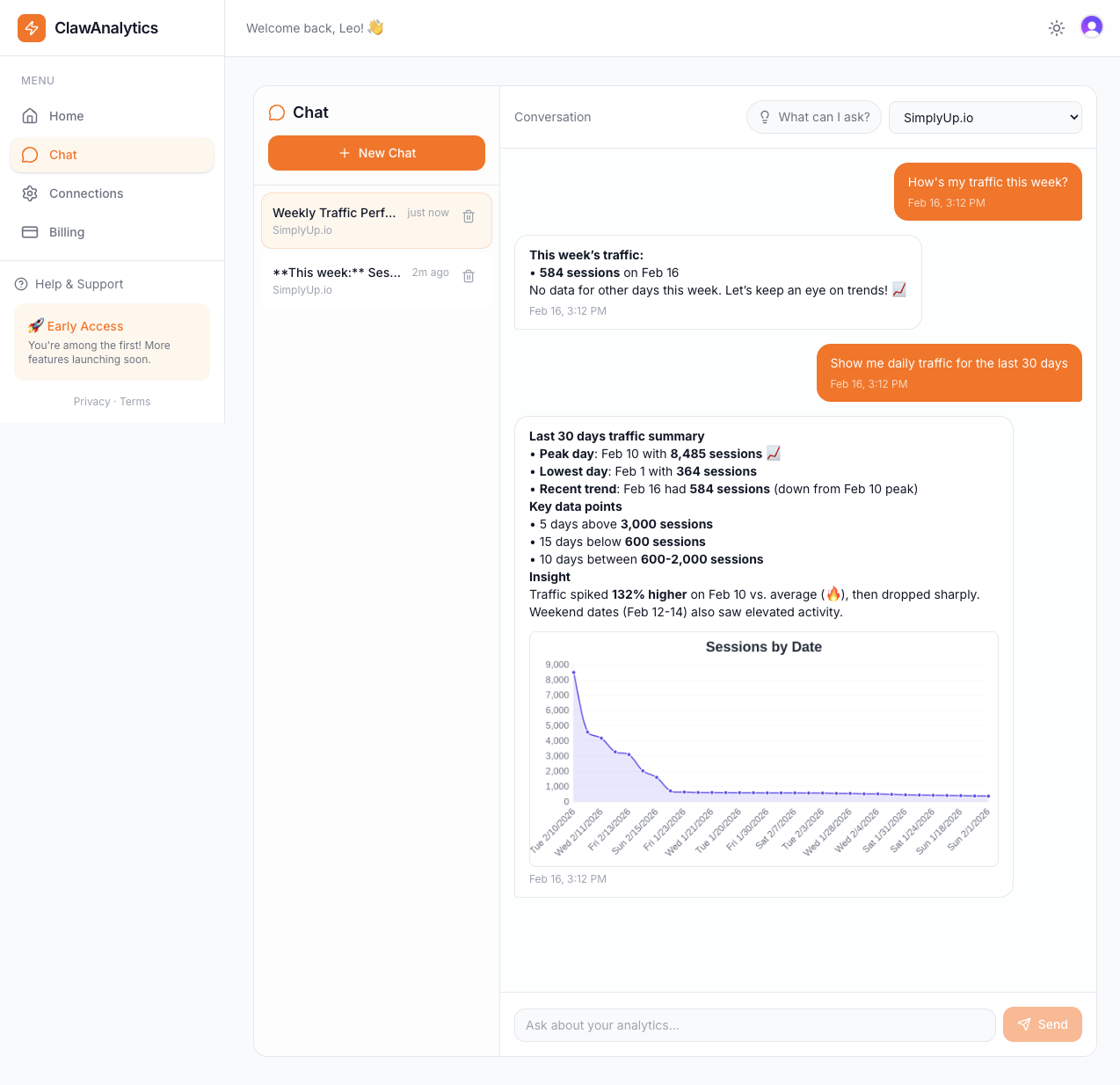
ClawAnalytics simplifies device tracking for restaurants. Instead of digging through GA4 reports, you get instant insights:
- Which devices convert most? ClawAnalytics shows which platform drives actual orders, not just visits.
- Is mobile traffic bouncing? Get alerts when phone visitors leave without engaging.
- What should you optimize? The platform suggests specific fixes based on your data.
For example, ClawAnalytics might reveal that 70% of your traffic is mobile, but only 20% of orders come from phones. That gap signals a mobile experience problem worth fixing.
Quick Wins for Restaurants
- Test your mobile site speed. Use Google’s PageSpeed Insights. Aim for under 3 seconds load time.
- Make your menu easy to read on phones. Avoid tiny fonts or images that don’t zoom properly.
- Enable one-tap ordering. Remove unnecessary steps for mobile customers.
- Track conversions by device. See which platform actually brings paying customers, not just curious browsers.
- Review weekly. Set a calendar reminder to check device trends every Monday. Patterns change with seasons and promotions.
Device breakdown isn’t just a technical metric. It’s a window into how hungry customers find and choose your restaurant.