Every hungry person walking past your restaurant is a potential customer. They pull out their phone to check your menu, hours, and reviews. If your website is slow or hard to navigate on mobile, they keep walking. Device breakdown tells you exactly how customers find and interact with your restaurant online.
Understanding device breakdown means knowing whether customers use phones, tablets, or desktop computers to visit your site. More importantly, it shows what they do once they arrive. Do mobile visitors order takeout? Do desktop visitors book tables for groups? These behaviors shape your website priorities.
Why Device Breakdown Matters for Restaurants
-
Mobile dominates the food industry. Hungry customers search on phones near your location. They want instant answers: what is on the menu, how long until pickup is ready, do you have tables now.
-
Order behavior differs by device. Mobile users often want quick takeout orders. Desktop users might plan catering for events or book private dining rooms. Treating all traffic the same misses these differences.
-
Review and discovery happen on mobile. Most customers check reviews on their phones before choosing a restaurant. Your mobile presence affects first impressions more than any other factor.
-
Tablet usage is niche but valuable. Tablet users often browse for special occasions or group dining. They typically have higher average order values. This audience deserves specific attention.
How to Check in GA4
Open GA4 and navigate to Reports, then Users, then Device category. You will see a breakdown of desktop, mobile, and tablet visitors. The percentages matter, but so do the behaviors.
Scroll down to see metrics like pages per session, average engagement time, and conversion events. Look for differences between devices. Mobile might show more sessions but lower conversion. Desktop might have fewer visits but higher order values.
Create a custom report that segments by device and includes key restaurant actions: menu views, order completions, reservation submissions, and direction requests. This shows the full customer journey by device type.
The Easier Way
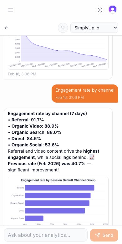
ClawAnalytics filters restaurant-specific data into actionable insights. It shows which devices drive revenue through orders versus reservations. For example, it might show that while mobile brings 70% of traffic, desktop generates 60% of catering revenue.
Restaurants commonly ask: “Should we focus on our mobile app or mobile website?” ClawAnalytics helps answer by showing how each channel performs. Another question: “Which menu pages need mobile updates?” The tool flags pages where mobile users bounce quickly.
ClawAnalytics also tracks device trends over time, helping you prepare for seasonal shifts like increased mobile traffic during food holidays or events.
Quick Wins
Prioritize mobile menu accessibility. Your menu must load fast and display clearly on phones. Use large images, readable fonts, and clear prices. Customers should find what they want in seconds.
Ensure online ordering works perfectly on mobile. Test the full order flow on several phones. Remove unnecessary steps. Offer Apple Pay and Google Pay for one-tap checkout.
Add click-to-call buttons prominently on mobile. Every page should have a clear call-to-action that dials your restaurant directly. Reduce friction for customers ready to order.
Optimize for “near me” searches. Mobile users often search with location intent. Ensure your Google Business Profile is complete and your website loads fast for local mobile searches.
Track conversion by device. Set up events in GA4 for order completions and reservations. Compare rates across devices. If mobile orders lag, investigate checkout friction.
Finally, monitor your competitor’s mobile presence. Visit rival restaurants on your phone. Note what works better. This competitive insight helps you stay ahead in a crowded market.