A customer tries to order lunch from your restaurant on their phone. The menu loads slowly, the checkout process is confusing, and they give up. They order from your competitor instead. Every broken mobile experience costs you a sale.
Device breakdown shows how customers actually interact with your restaurant’s online presence. This includes ordering, reservations, menu browsing, and reviews.
Why Device Breakdown Matters for Restaurants
Mobile dominates restaurant discovery. People hungry now pull out their phones to find nearby options. They check menus, compare prices, and decide where to eat in minutes.
Desktop users often plan events or orders in advance. They’re likely ordering for groups or making reservations for special occasions. Tablet traffic tends to be casual browsers who might convert later.
If your online ordering system only works well on desktop, you’re ignoring most potential customers. Mobile users expect seamless experiences. Slow or confusing interfaces drive them away fast.
Understanding device patterns helps you invest wisely. A fast-casual restaurant with 80% mobile traffic needs an excellent mobile ordering app. A fine-dining establishment might prioritize desktop for detailed menu exploration.
How to Check in GA4
Open GA4 and navigate to the Tech section. Click on Devices to see your traffic split. Note what percentage comes from mobile, desktop, and tablet.
Next, look at your conversions. Create a segment for each device type. Compare how often mobile users complete orders versus desktop users.
Check your key pages individually. Look at menu pages, reservation pages, and checkout flows. Identify where mobile users drop off. This tells you exactly what needs fixing.
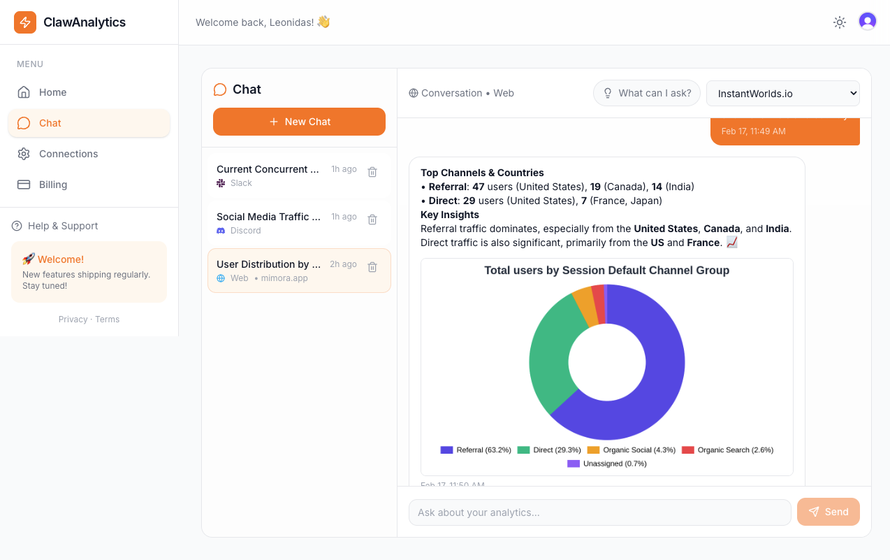
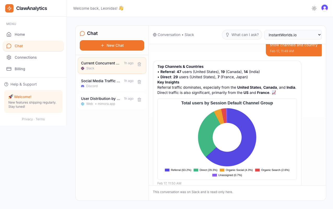
The Easier Way
ClawAnalytics makes device insights simple. You can ask questions like “Which device has the highest order value?” or “Where do mobile users drop off in our ordering process?”
Restaurant managers get answers without digging through complex reports. The tool explains what the numbers mean for your business.
Restaurants using ClawAnalytics often discover surprising patterns. They might find that tablet users spend more per order. Or that mobile users convert better on certain menu pages. These insights drive real improvements.
Quick Wins
Test your online ordering on a smartphone right now. Go through the full process. Note any frustration points. Ask employees to do the same and compare notes.
Optimize your menu for mobile. Use clear headings and large tap targets. Avoid tiny font sizes that force zooming. Customers should read easily without pinching.
Ensure your phone number clicks to call. Many customers prefer calling for large orders or special requests. One-tap calling reduces friction.
Make sure your Google Business Profile loads correctly on mobile. Most restaurant discovery happens through search. Broken listings mean lost customers.